UserEcho for the mobile web
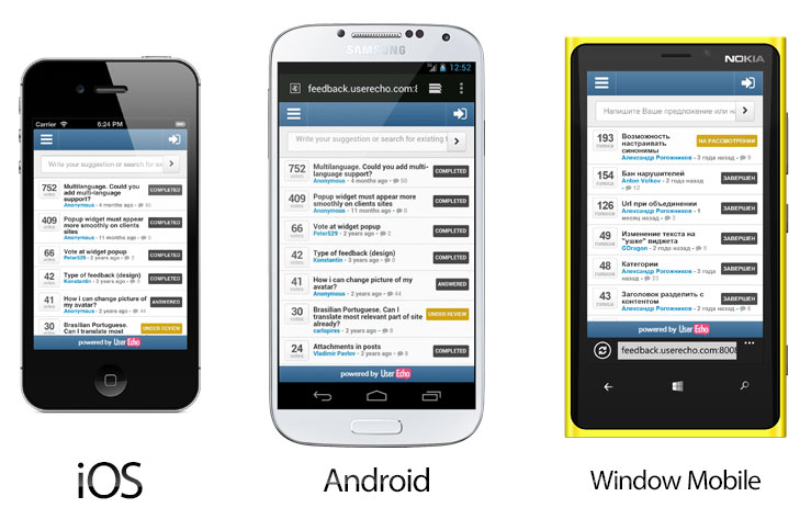
This month we have optimized the UserEcho interface for a mobile devices. Now all functions is accesible and optimized for the touch interface.

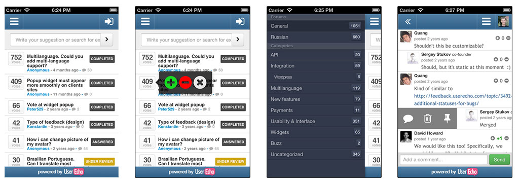
Find out some screenshots of varios parts of the mobile interface. Main dashboard, voter, side menu with forums & categories, comment's actions panel.

We are very excited about our continuing plans for mobile optimization. Our nearest plans includes Mobile SDK for the iOS and Android, so it will be possible to embed UserEcho community directly in the your mobile applications.
Let us know if you have any feedback or issues with the new mobile version.


Hey,
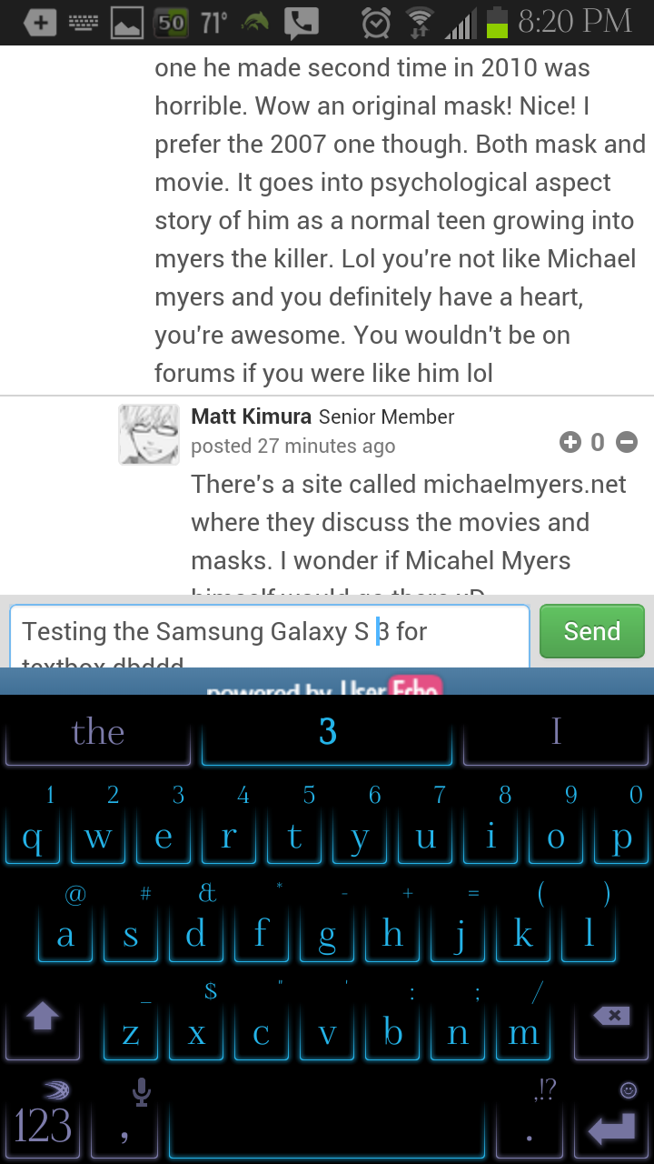
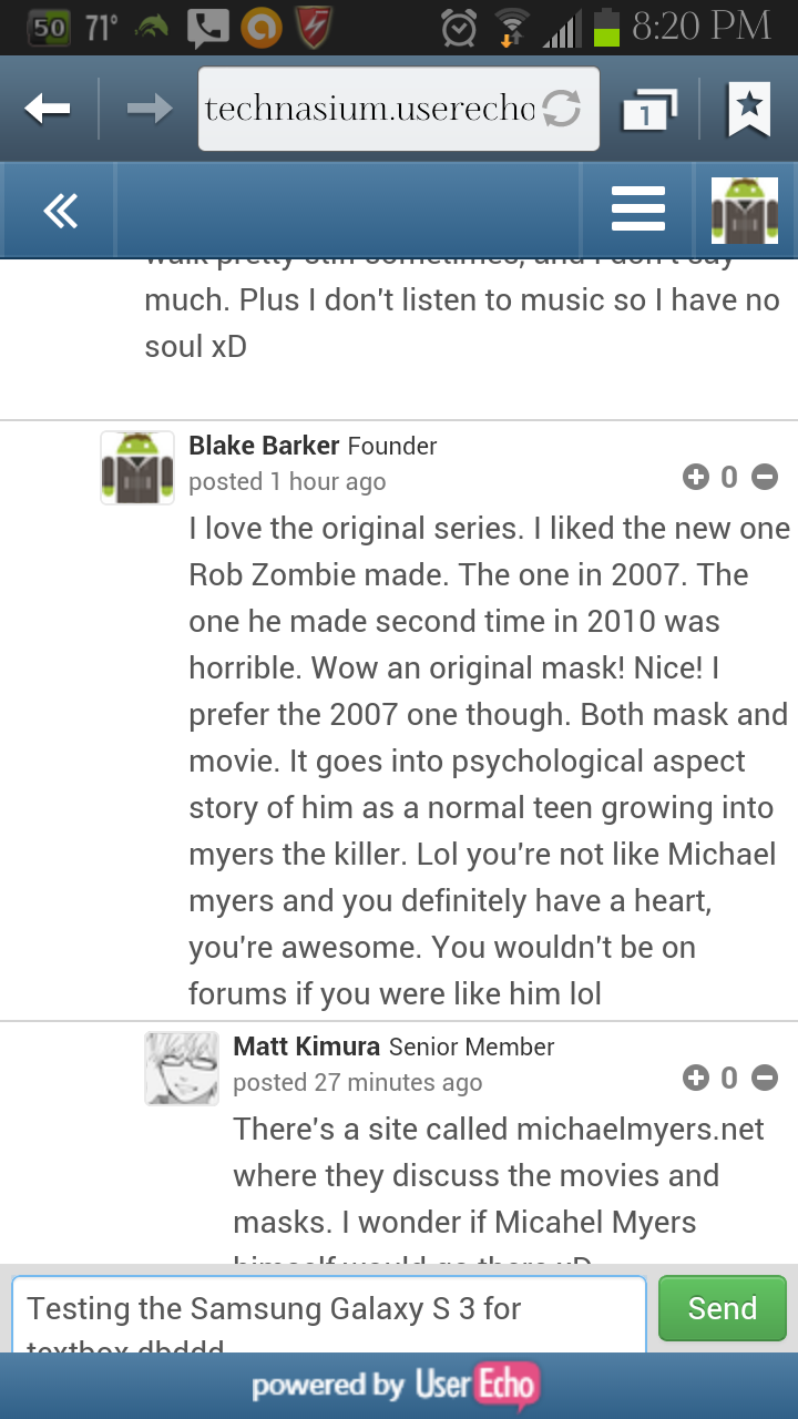
I LOVE IT! However, I'm having an issue. The powered by UserEcho banner on the bottom coveres my ENTIRE textbox, so I can't see what I type, and I constantly have to Swipe the text box up, especially to press send multiple times.Here are images. It even gets worse soemtimes when i type more. Most of time, it's completely covered and no text is visible at all.