Agent's interface in mobile mode has been improved
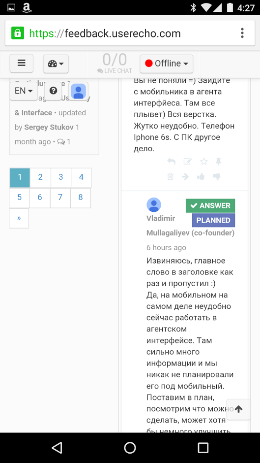
We've significantly improved the Agent's interface (topic's review) in the mobile mode. We've separated the topic list view and topic view on two screens. Take a look on screenshots.
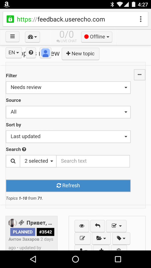
Filters: better alignment and buttons from top bar do not overflow filters.
 VS
VS 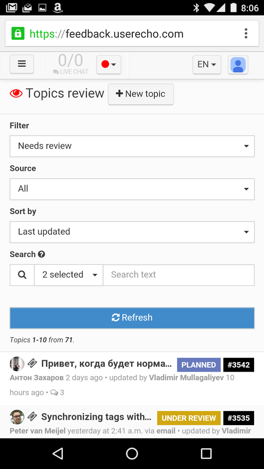
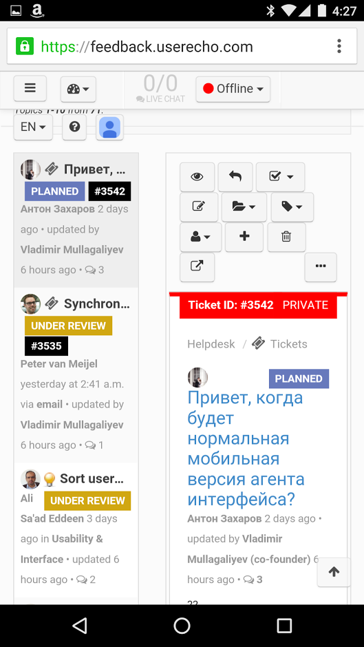
Topic's list: more wide = better view
 VS
VS 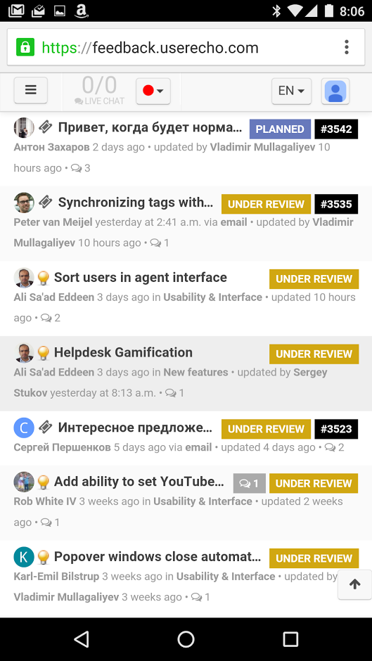
Pagination: all pages in one line
 VS
VS 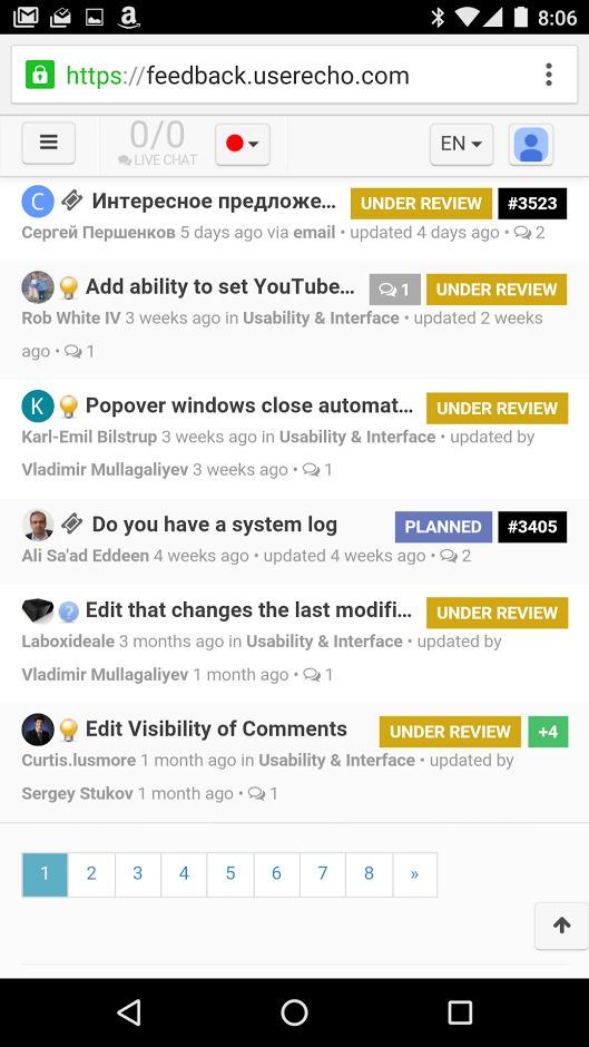
Topic view: much better representation on full width
 VS
VS 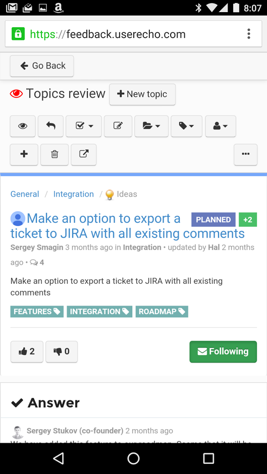
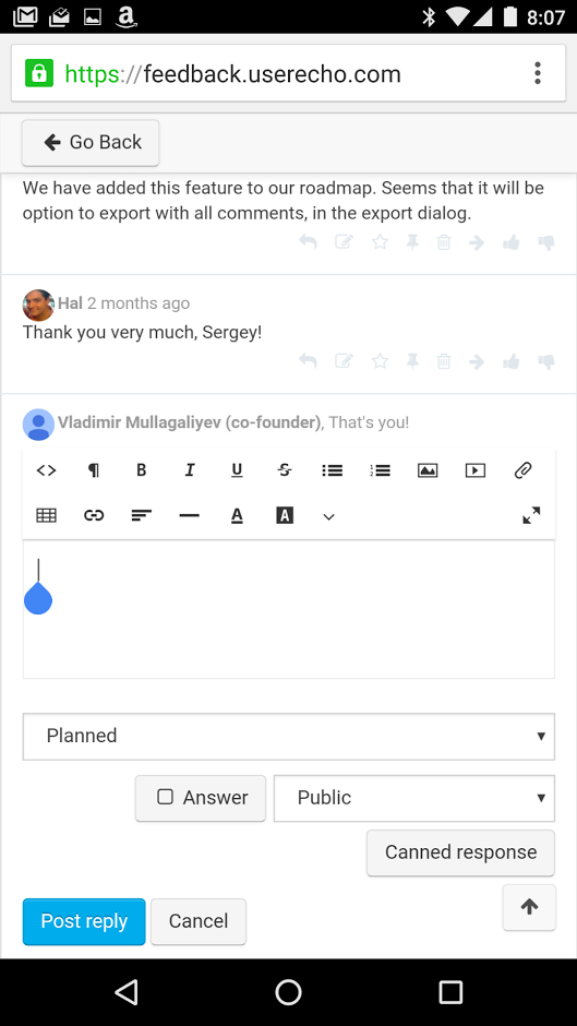
New comment: redactor takes full width of screen
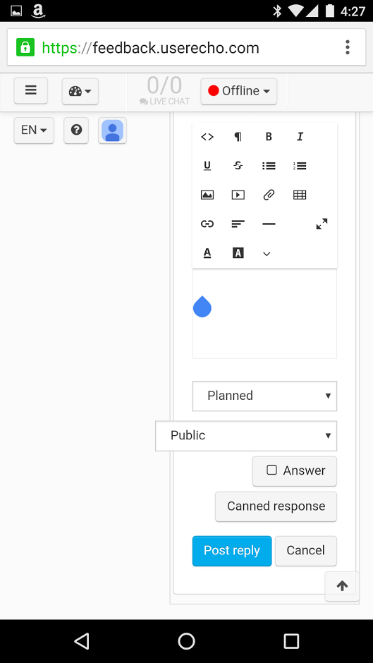 VS
VS 