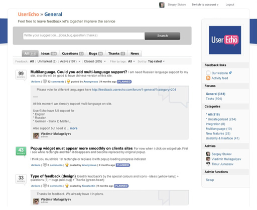
Icons for feedback, design, new voter
We updated our voter design
Score digits on "Voter" shows difference between positive and negative votes. (1) For vote you must click up or down arrow that appears when you place mouse over "Voter" (2) "Voter" becomes green when you vote for idea belongs to it (3) and becomes red (4) when you vote against
Each feedback has corresponding icon
QUESTION-(1), IDEA-(2), THANKS-(3), BUG-(4), NEWS-(5)
![]()
New internal design of feedback forum:
- The internal design has become more sophisticated and user-friendly


http://feedback.userecho.com/feedback/6660-please-return-updown-vote-counts/
как раз то о чем Вы говорите идет фаза портирования на броузеры к вечеру надеемся запустить